The new version 0.3 of ShadedBorder supports gradient backgrounds:
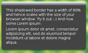
Have a look at the updated example.
The new feature is quite intuitive to use. You need some one pixel wide gradient background image with any height you like, which when repeated in x direction gives you your gradient (grad.png). All you need to know is the color of the last (bottom most) pixel in this image, let it be #444444 a dark gray in this example.
Then simply add the following rule for each of the elements which should be “bordered” to your CSS style sheet:
#shadowed-border .sb-inner { background:#444444 url(grad.png) repeat-x; }
That’s it. Thanks to Piotr for reminding me that this feature was missing 😉 And thanks to all you guys answering questions in the comments section of ShadedBorder – it’s getting kind of a forum, right? 🙂
While touching the code I also added an optimization which results in much less DIVs generated and should give quite some speed improvements.