… or: “Cross Browser display:inline-block”.
If you ever wanted to display a list of items horizontally with a wrap around once the right margin of your page has been reached, you came across a float:left solution. And if you ever tried to line up items with different heights this way, you know how messy things can get… Here’s an example:
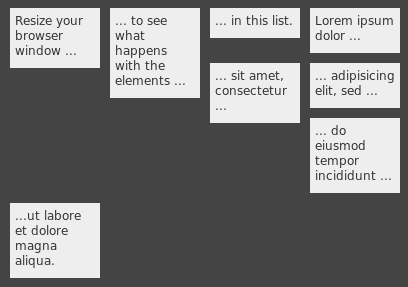
Well, yeah… not exactly what you wanted, I guess… It would be nice to have something similar to this:
Usually at this point you stop bothering and use a table, right? 😉 But what about liquid layouts? It would be nice to have “something” that can do the trick with a simple unordered list (ul).
Actually, CSS has a solution for this problem: setting the item to display:inline-block will do. There’s just one minor problem. inline-block is currently only supported by Safari and Opera in a usable way. There are workarounds for Internet Explorer and Firefox. The one for Firefox is extremely buggy, especially when it comes to manually setting the width of an item or when wrapped text should be supported.
I combined the workarounds and found a way to deal with fixed widths of items which results in a cross browser solution for the problem. Check out the demo.
Lets have a deeper look into the six tests of the demo page. All tests are using the exact same markup for the lists – no quirks here ;-).
Test 1: Floated
Just a demo of what we do not want…
Test 2: Standards compliant
With display:inline-block elements get a layout as if they were display:inline, but at the same time they can contain display:block elements. Here are the CSS rules:
#test2 li { display:inline-block; width:60px; vertical-align:top;
              overflow:hidden; }
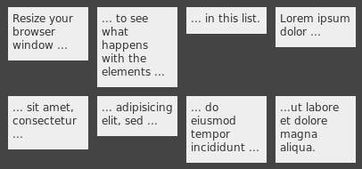
When setting the “li” elements of our list to this display type, we exactly get the effect we want:
Safari and Opera are fine with that – Internet Explorer and Firefox are not… They still display our items as regular block elements.
Test 3: Internet Explorer 6 and 7
Bruno (Fassino?) presents a way to force Internet Explorer 6 to display an element as inline-block. After it has been set to display:inline-block, you overwrite the rule with a second rule to display:inline – and it will do. Yeah I know that’s sounds strange, but it works. I’m using two different CSS filters to also support IE 7:
#test3 li { display:inline-block; width:60px; vertical-align:top;
            overflow:hidden; word-wrap:break-word; }
* html #test3 li { display:inline; }  /* for IE 6 */
* + html #test3 li { display:inline; }  /* for IE 7 */
Test 4: Firefox?
Firefox. Hmhm. Firefox… Well, Firefox doesn’t know inline-block at all. Nicholas C. Zakas describes the problem and suggests to use -moz-inline-stack instead. Right. -moz-xxx stuff. We have to dive deep into the Firefox/XUL internals to find a solution. Stacked elements however are not what we want – we want block elements inside our inline-block. Hence most of the time -moz-inline-box is suggested. The default alignment for elements of a -moz-inline-box however is horizontally. -moz-box-align:vertical helps us here:
#test4 li { display:-moz-inline-box; display:inline-block;
            width:60px; vertical-align:top; overflow:hidden; }
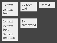
But wait – when setting the width of the items (with overflow:hidden), the layout completely collapses:
Apparently -moz-inline-box doesn’t like to have a fixed width and a hidden overflow…
Test 5: Firefox!
So we set the width to the child elements of the list items. This means that only block level elements are allowed to be children of a list item. Not that much of a restriction…
#test5 li { display:-moz-inline-box; -moz-box-orient:vertical;
            display:inline-block; vertical-align:top; }
#test5 li > * { display:table; table-layout:fixed; width:60px; overflow:hidden; }
Yeeha – that does the trick!
Test 6: Combining the magic
Loads of browser specific stuff. Here’s how I combined the rules in order to make the layout work cross browser, i.e. in Internet Explorer, Firefox, Safari and Opera:
#test6 li { display:-moz-inline-box; -moz-box-orient:vertical;
            display:inline-block; vertical-align:top; word-wrap:break-word; }
* html #test6 li { display:inline; }
* + html #test6 li { display:inline; }
* html #test6 li { width:60px; }
#test6 li > * { display:table; table-layout:fixed; width:60px; overflow:hidden; }
Enough chit chat! How do I use it?
Woa – you read up to here! Here’s a simple way to use the solution. Hack together some markup similar to this:
  <ul class="ib-fix demo-ul"><!--
   --><li><p>Resize your browser window ...</p></li><!--
   --><li><p>... to see what happens with the elements ...</p></li><!--
   --><li><p>... in this list.</p></li><!--
 --></ul>
The HTML comments are required in order not to have any white spaces inside the “critical section” – we are dealing with inline elements here… See also the limitations section.
Now, add the following ib-fix (“inline-block-fix”) class rules to your style sheet:
  .ib-fix li { display:-moz-inline-box; -moz-box-orient:vertical;
               display:inline-block; vertical-align:top; word-wrap:break-word; }
  * html .ib-fix li { display:inline; }
  * + html .ib-fix li { display:inline; }
  .ib-fix li > * { display:table; table-layout:fixed; overflow:hidden; }
And set the width of your items via something similar to this:
* html .demo-ul li { width:80px; }   /* for IE 6 */
.demo-ul li > * { width:80px; }      /* for all other browser */
That’s it – happy aligning.
Limitations
- Always keep in mind that you are dealing with inline elements. As opposed to block level elements, spaces between inline elements are displayed.
- The children of a ib-fix layouted element have to be block level elements, i.e. must not be text children.
- When modifying the DOM via JavaScript, use a single wrapper DIV as the child of your item – otherwise Firefox will insert strange new lines…