There are many ways to do rounded corners on web pages. This tutorial describes a solution based on RUZEE.Borders. It shows how the web page has to be structured and how to add a drop shadow to an HTML element – everything without using any pre-rendered images.
Step 1 – HTML/CSS basics
We’ll start with a simple HTML page. The body of the page is pretty simple:
<div class="bordered">
  <p>This is the paragraph</p>
  <p>This is another paragraph</p>
</div>
The DIV, which has the class “bordered”, is used to define the width and the style – in our example for drawing a border around. There are two paragraphs in this inner DIV, basically to add some text so we’ve got something to read ;-).
The definition of the class, i.e. the definition of the style of the HTML elements on the page, takes place in an internal Cascading Style Sheet (CSS):
.bordered {
  width:200px;
  border:3px red solid;
  padding:30px;
}
The DIV will get the width of 200 pixels by the class definition “.bordered” (which is a CSS selector). It will also get a solid red border with a width of 3 pixels and a padding of 30 pixels which lets the text inside have some spacing to the red border. This padding will be important later on, when we round the border. Ah, right – of course up to now, the border is not rounded and there’s no shadow. We’ve just used basic HTML/CSS methods to get our result.
See how the whole page looks like here (and view the source code, of course ;-)).
Step 2 – Let the script round it
To round the border, RUZEE.Borders and its dependencies have to be included. This is done with the following lines in the header of the HTML document:
<script type="text/javascript" src="cssquery2-p.js"></script>
<script type="text/javascript" src="ruzeeborders.js"></script>
The first line includes cssQuery, a library by Dean Edwards that makes CSS selectors usable via JavaScript. The second line includes RUZEE.Borders.
Once the scripts have been included, they can be used via “self-made” JavaScript code. So, let’s round the border from “Step 1” now:
RUZEE.Borders.add({
  ".bordered" : {
    borderType:"shadow",
    cornerRadius:15,
    shadowWidth:10
  }
});
As you can see, this looks similar to the CSS definition. We see the CSS selector “.bordered” again and the meaning is just the same as within CSS: all properties afterwards will be applied to the HTML elements matching the criteria. In our example, this is the one DIV in our page.
It will get a shadowed border (borderType:"shadow") with a corner radius of 15 pixels and a shadow width of 10 pixels.
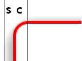 The image on the right explains these terms. The corner radius is the number of pixels from the center of the corner to its border (inclusive): “c” in the image.
The shadow width is the number of pixels from the border (exclusive) till the shadow is completely faded out: “s” in the image.
The previous code snippet however doesn’t do the actual rendering of the round borders. It just defines how to do that. The rendering is done via RUZEE.Borders.render(), but before rendering can start, the web page has to be loaded completely.
JavaScript has an event for this: window.onload. Inside this event you can add your code. You have to do the following:
window.onload=function(){
  RUZEE.Borders.render();
};
That’s it! You’ll now see a nice round border with a drop shadow on your site. Try it (and again have a look at the source code)!
As has been mentioned in “Step 1”, it is very important that you add some padding to the elements you want to round. This is because RUZEE.Borders draw themselves “into” the padding area and hence use some of the padding. As a rule of thumb the padding should be at least “corner radius + shadow width” pixels. But add some more pixels so the text will still have some spacing to the border, even when rounded.